Tuesday, June 22, 2010

Loose ends and a welcome!

I've been busy like a doozer at the gallery lately, so much to do in so little time! Why the timeline you ask? I have a maternity leave fast approaching, I'm wrapping up at the end of this week in fact. Unfortunately not all opportunities come parceled with great timing, but I've so enjoyed the whirlwind that has been my time at the gallery so far, and actually can't wait to get back next year. I can't say I've ever taken a mat leave reluctantly before now!

On that note, I would like give a huge welcome to our new programming co-ordinator, Katelyn O'Donnell! Katelyn has joined me for the last month in the gallery, and she will be stepping up as the interim Director in my place over the next year. A Concordia fine arts graduate, she already has great workshop plans coming your way for summer and fall. Katelyn will be commandeering this space as well as the gallery, continuing to give you insight and updates on the gallery happenings.

So something I've noticed should be done is your view into our last exhibition, Joss Richer's "Further Evidence of Human Presence". I'll leave you with the visuals of his beautiful work!


Tuesday, June 15, 2010

Rejuvenation

This Wednesday we are kicking off our summer programming with a trip to the Florenceville Elementary School to teach the K’s - 5’s an art lesson. We’ve been brain storming ideas for a while, and feel a need to connect the artists that have been exhibiting at the gallery with our lesson plan for the elementary school. Darlene Teahen’s exhibition, Rejuvenation, has been on our minds the most. This idea of rejuvenating and reinventing objects that are insignificant or no longer have importance is highly interesting to us.
   Darlene grows and studies sprouts, a minuscule plant organism that according to her and her husband the kids love to eat over any other veggie. In her larger than life paintings of these insignificant objects she uses brilliant colour tones to express her excitement with the idea of rejuvenation; that something so small as sprouts would often go unnoticed and seem unimportant, she uses the large size of the paintings to express how significant and amazing she feels these happenings are. She has even given the sprouts personalities through a sense of movement/ motion in her paintings. The sprouts have been reinvented into these vibrant personalities. Often times art can make you think about things that you’ve never thought about before. In this case Darlene uses her art to point out how amazing it is that life/ plants can go from something so small as a seed, into a whole plant.
   With Darlene in mind we decided to look at other artists that have used rejuvenation in their art work as well. Just about every artist uses rejuvenation in some way in their work, but we found three artists that explored rejuvenation in different but similar ways.
   Jacques Louise David explores ideas of rejuvenation in his portrait of Napoleon Bonaparte, Napoleon Crossing the Alps. Napoleon requested that David depict him riding this very muscular stallion across the alps giving the viewer the idea that Napoleon was this fearless man bravely set out to conquer, but in actual fact Napoleon was led by a guide across the alps mounted on a mule. Napoleon wanted to be remembered as this fearless entity instead of as a regular human being who has weaknesses, so he reinvented himself into this very masculine man. This is a form of rejuvenation. Napoleon was breathing new life into his image. He didn’t want to be seen as a weakling. The idea of rejuvenation was a very common process in that time for portraits. Just like we have airbrushing they just asked the artist to tweak a few things here and there.
   Marcel Duchamp could be seen as the pioneer for creating recycled art. Recycling is a form of rejuvenation. Duchamp liked to question the idea of what is art, who says that this is art. He was very “anti-art.” Duchamp also began to explore the ideas of found art along side anti- art, and what flourished from this combination was his piece titled, Fountain. The “fountain” that he created was actually an old urinal that he found, but by taking this found object and creating a new use for it he was rejuvenating it, breathing new life into an old object. Bringing this piece of garbage back to life. Giving it new meaning.
   Jane Elizabeth Perkings is a UK artist who uses found objects in her art as well, and assembles these objects into portrait mosaics of famous people. They are quite amazing in their accuracy. Her found objects usually consist of some form of plastic (forks, buttons, old toys). She is rejuvenating these objects, giving them new significance and value.
   With these four artists in mind we decided the best way to get the ideas of rejuvenation across to the students was by getting them to build mosaics from every day insignificant objects. They will assemble these objects onto a printed image, but each student will put their own twist on these images. They will combine the objects and the image together to create a new and improved image. Even if several students pick the same image each image should come out marked by the students own individual interpretation. This is a person’s perspective, or their point of view, which means the way they look at it and what ideas it reminds them of. Art is great in that it offers a way for people to express their different views and create something visual about what is an important topic to them.

Saturday, May 15, 2010

Messaging

Yesterday we had two graphic design classes come into the gallery from Carleton North High School. First, I'd like to mention how proud it makes me to live in an area that offers such a great art program. The very fact that there is not only one, but two full graphic design classes (along with numerous other art classes), speaks to the fullness of the offerings in visual education here. Kudos to the highschool and their art staff! I went to this highschool at one time and even then had the pleasure of learning and being encouraged in art by the very same art teacher, Mrs. Galbraith - although I'm attempting to transition to calling her just 'Susan' now! There were many university conversations where my peers were astounded to hear that I had been able to take graphic design in highschool, a program unheard of in their schools. The art curriculum here has continued to thrive and grow and I am so pleased to be able to take part now in offering access to visual education in our community.

The students were great participants as we discussed Joss' artwork and the topics of messaging, self-portraits, and in relation to their current studies, comparing and contrasting fine art and graphic design.

In both art and graphic design there is a message. There is what the artist/creator/designer intends to say through their work, and then what the viewer interprets. And these two are not the same.

The intended message and the interpretation are different because everyone has a different bias, a different perspective and a different way of viewing the same visual clues. People's different perspectives are shaped by their experiences, influences in their lives, education, knowledge, and the information that is available to them. It's not only major events in one's life that shapes their perspective, but things the viewer has done and seen, the family the were raised in, their culture and heritage and language and community, world events that happen around a person, what era they were raised in and by whom. Education and knowledge not only refers to one's formal education, but the perspectives of their teachers and their informal education. The areas of interest one has pursued lead to areas of expertise and experience in certain fields. We discussed how everyone has topics that pique their interest, leading them to notice and read up on the topic, to watch shows on the topic, to immerse themselves in activities of that topic. All of these elements create a person's unique perspective that effects their interpretation of anything, in this case art.

We discussed what messages the art conveyed to them purely through the work itself, and then added the element of how extra information on the exhibition impacts their interpretation. We discussed how the title of the show, 'Further Evidence of Human Presence' and the titles of the artwork, along with the artists statement and the conversations a few students and myself had had with Joss himself on his art, impacted our interpretations of the art. The more information we have on the show opens us up to noticing and reading more visual clues.

The main difference between art and graphic design lies in this messaging. Fine art has the opportunity to be much more subjective, the message can be less clear and up for interpretation. The viewer is invited to consider and ponder the work and the artist's message, deciphering what it means to them personally. Graphic design however has to grapple with this point of perspective and attempt to attain objectivity. The graphic designer, paid by a client to communicate a certain message, tries to lessen the gap and variables between the intended message and the interpretation, presenting the most clear message possible by finding shared experiences.

Tuesday, April 20, 2010

Art for thought...

A few tidbits for the day:
  • We open Joss Richer's exhibition this Friday, April 23rd at 7pm. Be there or be square! I reallly like his art. Traditionally a 'drawer' myself, I also appreciate the written word (although you wouldn't guess it using words like 'drawer', lol) and what journaling has to offer, and I love how he combines these art forms in his work. His metalwork is incredibly fascinating. The process intrigues me, the way it appears to be a heavy, solid metal and is in actuality quite fragile intrigues me, and the final appearance intrigues me. A very multifaceted show. (He has a piece titled Boulder that I'm particularily fond of. His work meshes geographical landscapes with human form, can you guess my penchant for this piece?)
  • Another biggie in ALMAG conversation right now, Guess Who's Coming to Dinner is happening Saturday, May 1st. Tickets are ready for purchase and pickup at the gallery now! I'm excited and so curious, I wonder where I'll be dining?
  • It's bittersweet that WhiteFeather and Carol have packed up and their exhibition has gone home, although new art, a fresh exhibition, is exciting, we enjoyed having them at the ALMAG. New friends are good too though! You can follow WhiteFeather on Facebook, she constantly has fascinating local art tidbits to share! 
  • A random piece that caught my blogging eye today, what do you think of this installation piece, Rita's Wooden Living Room? Look at the use of pattern. No shading, just solid colors to bring that box room to life!

Saturday, April 17, 2010

Teachers are always teaching.

Such a big week! A little overview for you...
  • We are head-on tackling our annual Guess Who's Coming to Dinner event, coming to Florenceville-Bristol May 1st. Support your gallery while hosting or dining with us!
  • I also had a museum board meeting at Kings Landing earlier this week, chock full of interesting information. So many informative tidbits, to be expanded on some other time... 
  • I was the guest host at storytime upstairs at the library Friday morning for the preschoolers. I presented the new Stories in Art program I've been working on for the 3-5 group, an introduction to art via childrens storybook illustrators. Following our main topic this month, the common thread throughout these illustrators was mixed media. We had illustrators who created their art from plasticine, from paper, and even quilted illustrations. It was a very successful workshop, the kids seemed to have a really great time! Free rein of the art materials (yarn, papers, buttons, ribbon, feathers) and 'glue paint' (watered down white glue to apply with paintbrushes, great for sticking materials to) generally equals a good time for this crowd. To really push their brains outside of what they might think art is, there wasn't a marker, crayon, or paint in sight. But of course, that age doesn't need much of a push to think outside of the box, they haven't had as many years as the rest of us at being pushed into the box! 
Where I really learned a lot though was, of course, in my teachers workshop Thursday evening. Always at it, those teachers. This workshop was technically the first flop I've had. There were three of us. Just three. Wonky.

But the three of us sat and did our own mixed media self-portraits anyway. And ate brownies. Maybe I forgot to advertise that there would be brownies?! And it was sooo lovely! I'm going to do it again! I won't give up on the teachers workshops, not yet.

Here's a few things I learned from the teachers workshop:
  • Almost May is almost June, which in teacher language is 'school is almost done for the year'. Fall may be a better time to start this program.
  • My planned target for this workshop were the elementary teachers, who are responsible to cover visual art in their curriculum but who may not consider visual arts education to be their strong point. I'm thinking now that they may not be the group that I can actually attract to take an evening out to come do and talk art with us. The elementary teachers did look at me a little like I had three heads when I advertised the teachers workshop at their staff meetings, but they jumped at the idea of me coming in to offer childrens art workshops for their classes. So taking the art to them I will do! I hope, along with classroom workshops for the students, to offer art workshops for the educators via their professional development days. You likey?
  • And my grand discovery? The workshop actually did attract the highschool and middle school art teachers, people already dedicated to the arts and excited to meet with like-minded colleagues to soak up more about the topic. And the relaxing art making, along with the peer discussion on art techniques and how those can be applied to the classroom, was the perfect art therapy to end a crazy day. I'm thinking Thursday evening studio time at the gallery may be my new favorite idea to brainstorm! What do you think? Are you up for a little studio time at the gallery? We'll see what we can arrange...

Tuesday, April 13, 2010

Volunteer love.

Can I just send a little love out to my volunteers? 'Cause I do love them. They're so great!

I have about 15 volunteers from the local highschool who I have been working into the gallery fabric. They have been serving as extra hands at children's workshops - running their legs off to demands of fresh paintbrush water, manning the hot glue gun station, or simply providing encouragement and helping a little one talk out and articulate how they're going about their artistic vision. Just this month I was able to have this group of volunteers run an Easter Egg hunt entirely on their own. This was an Easter Egg hunt that is usually an annual affair but was on the precipice of not happening this year because the usual recreation staff were shorthanded and busy with a hockey tournament. Thankfully we had these volunteers who were willing and able to step up and facilitate the egg hunt for the community kids! It turned out to be a beautiful day perfect for an Egg Hunt in the park that brought out dozens of kids and their families.

I also have one volunteer who is coming in on her Saturdays, every two or three weeks, to work at the gallery. This weekend was the first Saturday and I came in this morning to a clean and organized storage room! Suddenly it seems so spacious! This has been an item on my to-do list for so long now, but kept gettting bumped to the bottom of the priority list. She seemed to gladly take it on for me, and installing the next exhibition should be so much easier with all of the hanging materials in one, organized place!

The volunteers seem to love being asked and the opportunity to help out (I know I would have loved the gallery exposure in highschool), and I love having their helping hands!

Thursday, April 8, 2010

An Easter overview.

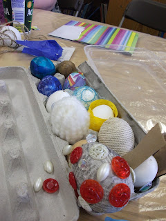
Let's talk mixed media and Easter eggs. Better yet, let's do it!


We talked about what mixed media is (which is using anything and everything to make art with!) and big hands and little hands created side by side. Family Art workshops may be my new favorite thing. What better to nurture the natural creativity littles have than to get the big people in their lives creating alongside them.